Email:

tekale.durgesh5@gmail.com

Email:

tekale.durgesh5@gmail.com

Saleshandy CRM

The goal was to design a pipeline-native CRM directly inside SalesHandy — eliminating the need for a separate CRM tool entirely, while giving SDRs a seamless, unified experience to manage prospects, track stages, and run outreach all from one place.

I'm passionate about simplifying complex sales workflows through thoughtful UI design. My mission is to turn disconnected tools into one focused, intuitive product experience.

Role

UI UX Designer

Category

CRM · B2B SaaS

Company

Saleshandy

Portfolio project image

01

Context

The problem

SalesHandy's SDRs were living in two tools simultaneously. Sequences and outreach lived in SalesHandy, but pipeline tracking required a separate CRM tab. Every time a prospect moved stages, a rep had to switch apps, update their CRM manually, then return. Nobody had designed the gap — it had just accumulated.

When this project began, the product had no native CRM view at all. Prospects existed as entries in a sequence, not as deals in a pipeline. The result was a workflow that forced reps to context-switch constantly, leading to sync gaps, inconsistent follow-up tracking, and critical prospect context scattered across two disconnected tools.

02

Research

Listening before assuming

Research surfaced four distinct breakdowns in the existing SDR workflow — each mapping directly to a feature requirement.

No pipeline native to SalesHandy

SDRs had no way to view their full pipeline without switching to a separate CRM tool. Prospects were managed as sequence entries, not as tracked deals with stages. A native Kanban board was the most requested missing feature.

CRM sync gap causing data loss

Stage changes in SalesHandy weren't reflected in the external CRM in real time. Reps either forgot to update both tools or updated the wrong one. The pipeline was perpetually out of sync with the actual outreach activity.

Inconsistent follow-up tracking across campaigns

Different campaign types needed different pipeline stages, but the existing setup forced all prospects into one rigid structure. B2B SaaS deals and agency outreach had nothing in common, yet shared the same stage columns inside the external CRM.

Optional fields weren't optional

Cards displayed the same fields for every prospect regardless of relevance. Reps had to scroll past irrelevant data constantly. The ability to configure which fields appear — and reorder them — was a clear unmet need.

03

Define

Sharpening the problem statement

How Might We

How might we give SalesHandy SDRs a complete view of their pipeline — without ever leaving the tool — so that outreach activity and CRM stage are always in sync?

Two primary user needs emerged from the research clusters: The Pipeline Manager (needs a bird's-eye view of all deals across stages, instant drag-to-update) and The Active Rep (needs deep prospect context — notes, emails, tasks, sequences — without switching to an external CRM). Both were underserved by the current product for entirely different reasons.

04

Ideation

From two tools to one screen

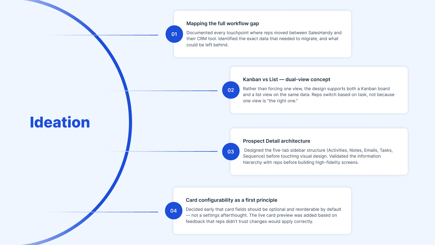
The core concept that drove every design decision: a CRM that lives entirely inside SalesHandy, with a Kanban-first pipeline view and a prospect detail panel so comprehensive that any external CRM becomes redundant — not migrated, not integrated, simply unnecessary.

05

Design

Every pixel with a purpose

High-fidelity screens were built in Figma across six feature areas, each mapped directly to a research breakdown. The design system was extended with purpose-built components: a floating drag-state card, a five-tab prospect detail sidebar, a live field preview panel, and an inline sequence assignment module.

06

Outcome

Impact, measured

07

Learning

What I'd do differently

The biggest design risk on this project was scope: a CRM is a large system, and designing six interconnected features in parallel means decisions made on Feature 01 have consequences for Feature 05. In hindsight, I would have locked the prospect detail sidebar architecture even earlier — it's the spine of the whole product, and the five-tab structure influenced every other feature's information model.

The other learning: the live card preview in Feature 04 was added late, based on rep feedback during design review. It should have been in the first concept. Whenever a configuration change is invisible until applied, a real-time preview isn't a nice-to-have — it's a trust mechanism.

"The best decision was treating the prospect detail panel as the product's centre of gravity, and designing everything else to orbit it." — Personal reflection

Let's create
something
extraordinary
together.

Let’s make an impact

Durgesh Tekale

UX Designer | Product Designer

Contact me

tekale.durgesh5@gmail.com

Hit me up if you’re looking for a fast, reliable web-designer who can bring your vision to life

Available for work

Let's create
something
extraordinary
together.

Let’s make an impact

Durgesh Tekale

UX Designer | Product Designer

Contact me

tekale.durgesh5@gmail.com

Hit me up if you’re looking for a fast, reliable web-designer who can bring your vision to life

Let's create
something
extraordinary
together.

Let’s make an impact

Durgesh Tekale

UX Designer | Product Designer

Contact me

tekale.durgesh5@gmail.com

Hit me up if you’re looking for a fast, reliable web-designer who can bring your vision to life

Create a free website with Framer, the website builder loved by startups, designers and agencies.